Cocktail Bar Branding
and Website Design
At the beginning stages of the development of the upcoming Killjoy Cocktail, a new cocktail bar opening in downtown Raleigh, the owners reached out to me looking for a concept for branding and the design of a new website. I met with the bar manager Zack to learn more about his vision for the branding. Zack was inspired by old school tattoo art and 1920s vintage valentines. He wanted to incorporate these concepts into the designs. I was intrigued by the polarization of the word killjoy and felt that there was so much creative potential in portraying this concept through visual design. I submitted a few logo design concepts to the team that explored the relationship and ying and yang of killjoy and the pain and sadness that accompanies love. Each concept explored a different style to allow the client to choose which style blended well with the feel of the space. The green and pink color scheme tied together the existing color scheme of the furniture they'd purchased to go inside the bar.
CLIENT
Killjoy Cocktail
PROJECT
Logo, Branding, and Website Design
MY ROLE
Art Direction, Logo Design,
Website Design, UX

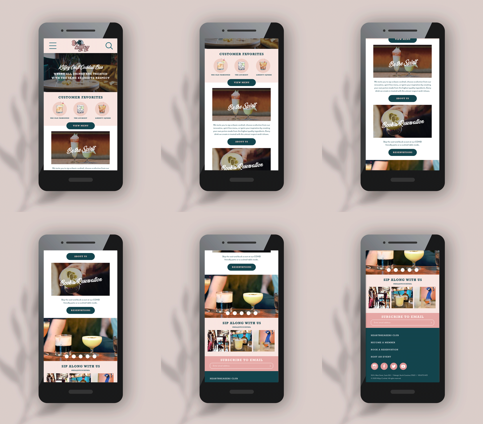
Along with the four logo concepts, I also submitted a concept for the website design using one of these logo concepts. To create the site structure and navigation, I considered the primary reasons why someone would visit the site; to book a reservation, explore the vibe of the space, and view menu offerings when they were already in the space (due to COVID restrictions, they would have a mobile-only menu). In identifying these purposes, I could conclude that the mobile design of the site should be considered first and look as beautiful and navigate just as easily as the desktop version.
I designed the new website to showcase the vibrancy and colorfulness of the venue. On the homepage, an area for customer favorites would be switched out each menu with three of the best selling cocktails. Sections of the site explained what made it unique and helped them stand out against their competitors; their passion for their craft, the instagramable space, and shared sobriety with their extensive non-alcoholic menu offerings. A homepage carousel allows users to swipe and see many photos of the interior of the space. The About page was written with personal details about the bar owners. The menu page was clean, fun, and even showed some photos of each menu offering in each category. Users could collapse the menu categories by clicking the large category image to make navigating a longer menu on mobile a breeze. Although the bar owners decided to move in a completely different direction with the overall brand and design than they had originally discussed, I was proud of the concepts presented.